You've spent months writing your manuscript. Don't let a colour space error ruin the first impression of your printed book.
Here's the scene: you upload your interior file to KDP, heart pounding, and a red error appears. "Images must be in grayscale colour space." Or worse, the file sails through review, and three weeks later your author copy arrives looking like a photocopied zine. The text has a faint grey halo instead of solid black. The photo on page 42 looks like it went through a fax machine twice.
None of that is unusual. Grayscale, monochrome and black-and-white get used interchangeably in everyday conversation, and that's fine for everyday conversation. It is not fine for a print-ready PDF. Print-on-demand platforms like Amazon KDP and IngramSpark have exact, unforgiving technical requirements, and a single mismatched image can derail a launch date you've been planning for months. Get the colour mode wrong and you're not just fixing a file, you're potentially paying more per copy for the rest of that book's life.
Part of the problem is where most printing advice comes from. It's written for office documents and home printers, not for the specific, fussier demands of book manufacturing. A photocopier doesn't care whether your PDF is technically in RGB or grayscale. A print-on-demand platform's validation system absolutely does, and it will reject the file before a human ever looks at it. That mismatch between generic advice and book-specific requirements is exactly why this confusion keeps tripping up so many otherwise careful authors.
The financial side is real too. Choose the wrong mode and you're not just risking a rejection email, you could be paying colour printing rates for a book that never needed to be anything but black ink on white paper, quietly eating into your royalty on every single copy sold.
This guide sorts out the confusion properly. You'll get plain definitions of grayscale, monochrome and pure black-and-white, a decision framework matched to your kind of book, platform-specific requirements for KDP and IngramSpark, and a step-by-step walkthrough for InDesign, Affinity Publisher and Word. We'll also cover what each mode actually costs to print, the ten mistakes that cause most file rejections, and a preflight checklist you can run before every single upload. By the end, you'll know exactly which mode your book needs, and you'll be ready to upload once and get it right the first time.
This piece is entirely about the interior file, the pages inside the book. If you're also working out your cover at the same time, that's a separate job with its own rules; we've written about how to design a book cover elsewhere, and it's worth reading alongside this one.
Clear Definitions: What Grayscale, Monochrome and Black-and-White Actually Mean
Let's clear up the terminology first, because this is where almost every file rejection starts.
What Is Grayscale Printing?
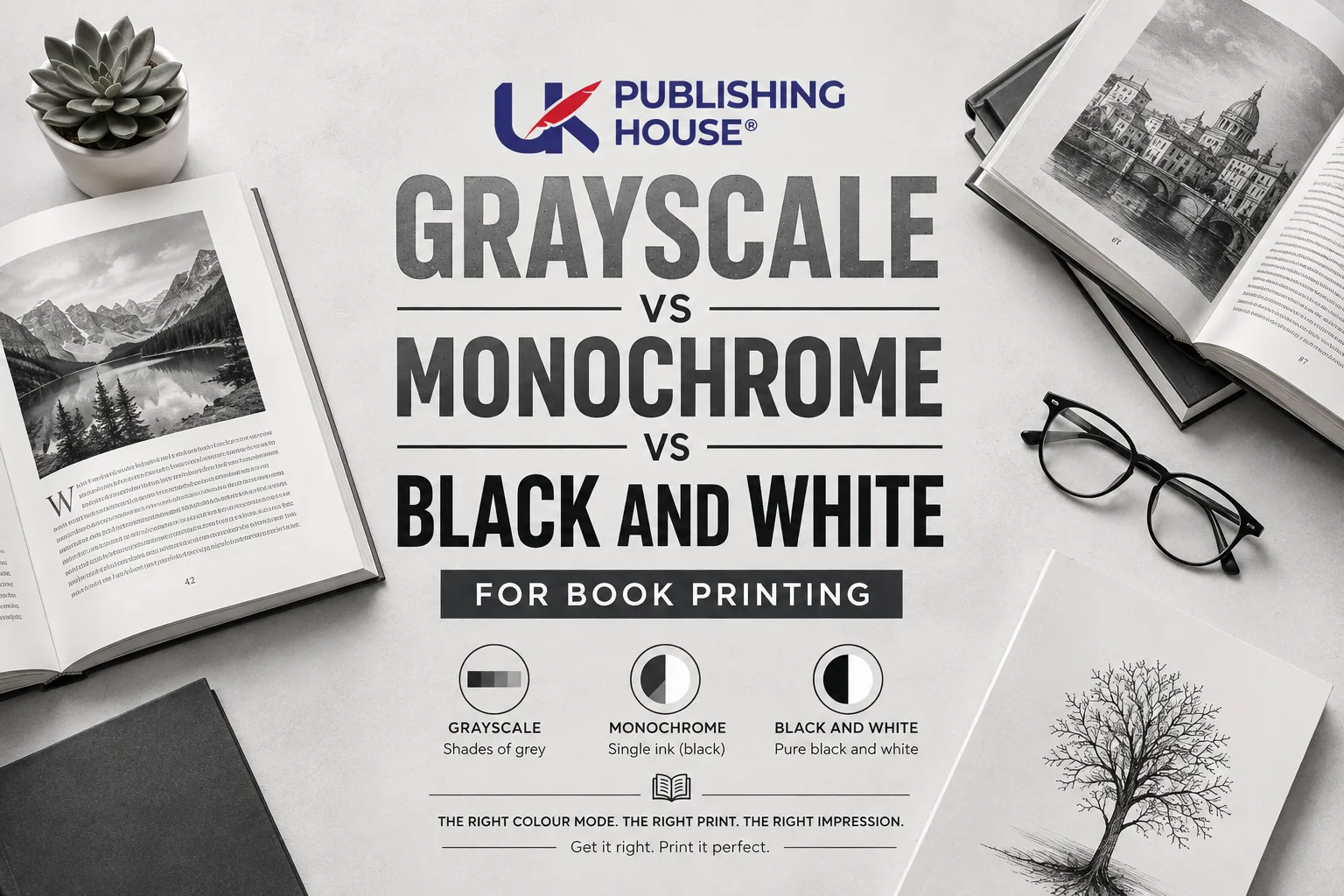
Grayscale uses up to 256 shades of grey, running from pure white to pure black, to reproduce continuous-tone images such as photographs. Every pixel can sit anywhere along that scale, which is what allows smooth gradients and fine tonal detail. If your book contains photographs or shaded illustrations, grayscale is the mode built for that job.
Expert tip: convert your images to grayscale in an image editor such as GIMP or Photoshop before placing them into your layout software. Leaving it to your layout program's "export as grayscale" option is a common mistake; it can mishandle colour profiles and give you results you didn't ask for.
What Is Monochrome (Black and White) Printing?
In book printing, "monochrome" is often used as a synonym for "black and white," but technically it describes printing with a single ink, usually black. A monochrome page can contain both 100% black elements, such as body text and rules, and grayscale images, because the printer is only laying down one ink. This is the standard setup for most text-led books that include the odd photograph or diagram, which covers a good chunk of what makes up the different parts of a book beyond the plain text pages.
Expert tip: for body text, use 100% black (K=100 in CMYK terms, or 0% in a grayscale file). Avoid "rich black," a mix of CMYK inks, which can cause hairline registration issues on thin paper and sometimes bumps up ink costs unnecessarily.
What Is Pure Black-and-White (1-Bit) Printing?
Pure black-and-white, also called 1-bit or bitmap, uses only two values: black and white. There is no grey at all. Every pixel is either fully on or fully off. This is the right mode for line art, pen-and-ink drawings, and any text where absolute sharpness matters. It gives you the smallest file size and the crispest edges of the three, but it cannot reproduce a photograph without converting it into a halftone pattern of dots, which looks coarse and dated.
Expert tip: if your book mixes text and line art, set the line art to bitmap mode at 1200 DPI for razor-sharp results, while keeping body text at 100% black. You get crisp edges without inflating your file size for no reason.
When to Use Each Mode for Your Book
Your choice comes down to three things: your content, your budget and the platform you're submitting to. Here's how that plays out by book type.
Book type | Recommended mode | Why |
Novels (text-only) | Pure black-and-white (1-bit), or monochrome with 100% black text | No tonal images to preserve, so grayscale only adds file size and cost |
Photo books, art books, memoirs | Grayscale | Preserves tonal range; avoids the harsh, dotted look of a 1-bit conversion |
Textbooks, workbooks, non-fiction with charts | Monochrome (black ink, grayscale images) | Keeps text sharp while letting charts and photos render with detail |
Graphic novels and comics | 1-bit for inked lines, grayscale for toned artwork | Many titles mix both: crisp lines plus soft shading |
Expert tip: KDP's black-and-white interior option is priced lower than its premium colour option. If your novel has no images at all, choose the black-and-white interior setting to keep your per-copy cost down and protect your royalty.
If you want the short version, here's the quick-reference logic:
Text only? Use 100% black, no grayscale needed.
Photos or gradient images? Use grayscale.
Line art, logos, simple diagrams? Use 1-bit black-and-white.
A mix of text and photos? Use monochrome (black ink, grayscale images).
This kind of decision sits right at the centre of good book design: matching the printing mode to the content is just as much a design choice as choosing a typeface.
A Simple Self-Test Instead of a Flowchart
If you like working through a decision tree, here's the same logic as a short self-test you can run against your own manuscript:
Does your book contain photographs or images with tonal gradients? If yes, use grayscale for those images.
If no, does it contain line art, logos or simple diagrams? If yes, use pure black-and-white (1-bit).
If it contains both text and photos together? Use monochrome: black ink for the text, grayscale for the images.
Whatever you answered, one last check: confirm your chosen platform's exact colour space requirement before you export, because KDP and IngramSpark don't always agree with each other.
Run your manuscript through those four questions and you'll land on the right mode almost every time.
Platform-Specific Requirements
This is the point where good intentions meet a validation system, and where book printing stops being a creative decision and becomes a technical one. Each print-on-demand service has its own file specification, and matching it exactly is the difference between an accepted file and a rejection email. The two platforms below cover the vast majority of self-published print books, but the underlying logic, correct colour space, embedded fonts, adequate resolution, applies almost everywhere.
Amazon KDP
Colour space: for black-and-white interiors, KDP wants grayscale. Colour interiors can use RGB. Mixing colour spaces within one file is one of the most common causes of rejection.
File format: PDF only, with all fonts embedded.
Resolution: 300 DPI minimum for every image.
Common rejection triggers: mixed colour spaces (one image accidentally left in RGB while the rest of the file is grayscale), fonts that aren't embedded, and low-resolution images.
Pricing note: KDP's black-and-white interior option costs less per copy than its colour options. If your book has no colour images, choose black-and-white to protect your margin. Pricing changes from time to time, so check KDP's current printing cost calculator before you commit to a format.
Expert tip: run your file through KDP's free Print Previewer before you commit. It simulates how your book will actually look printed and often catches colour space issues you'd otherwise only spot in a physical proof.
IngramSpark
Colour space: IngramSpark's file creation guide asks for grayscale for black-and-white interiors, and CMYK (not RGB) for colour interiors. This is a genuine point of difference from KDP, so a file built for one platform may need adjusting for the other.
File format: PDF/X-1a:2001 is IngramSpark's preferred standard. It flattens transparency, embeds fonts and keeps colour handling consistent through the print process.
Resolution: 300 DPI minimum.
Common rejection triggers: the wrong colour space, missing bleed where it's needed, fonts that aren't embedded, and low-resolution images.
A practical extra step: IngramSpark requires you to supply your own ISBN, unlike KDP. If you haven't sorted that side of things yet, it's worth doing alongside your file prep rather than after, and it's exactly the kind of groundwork our publishing team helps authors work through.
Expert tip: use IngramSpark's free file validation tool before you submit. It's a genuinely useful second opinion on top of your own preflight check.
Other Platforms (Lulu, BookBaby, and Similar)
Most other POD services follow a similar pattern: grayscale for black-and-white interiors, PDF/X-1a where possible, 300 DPI images, and embedded fonts throughout. Specifics still vary, so always check the current help documentation for whichever service you're using before you upload, since these requirements do shift over time.
Step-by-Step File Preparation
Here's how to set each mode up correctly in the three tools most self-publishers actually use. If you'd rather hand this stage over entirely, this is precisely the kind of work our formatting service takes off your plate.
Adobe InDesign
Set up your document with a Print intent and your correct trim size. In the Swatches panel, make sure body text uses [Black] at 100% K, not [Registration], which is a common and costly mix-up.
Place your images after converting them to grayscale in Photoshop or GIMP. Check the Effective PPI in the Links panel; it needs to read 300 or higher.
Export via File > Export > Adobe PDF (Print), and choose the PDF/X-1a:2001 preset. Under Output, set Color Conversion to "Convert to Destination" and the destination profile to Gray Gamma 2.2 for IngramSpark, or check KDP's current recommended profile if submitting there. Make sure "Embed Fonts" is ticked.
Preflight using InDesign's built-in Preflight panel to catch missing fonts or low-resolution images before you export.
Affinity Publisher
Set up your document using the Press Ready preset, then adjust to your page size. In Document Setup, set the colour format to Gray/8 or Gray/16.
Handle your images by converting them to grayscale externally, or by applying a Black & White adjustment layer in Affinity Photo before placing them.
Export via File > Export > PDF, choosing the PDF/X-1a:2001 preset. Under Color Space, select Gray, and make sure Embed Fonts is switched on.
Check your work using the Preflight panel to confirm resolution and colour space before you send the file anywhere.
Microsoft Word (For Simpler Projects)
Prepare your images in an external image editor and convert them to grayscale before you insert them.
Match your page size to your chosen trim size under Layout > Size.
Export to PDF via File > Save As > PDF, and under Options, choose "Standard (publishing online and printing)" rather than a web-optimised setting.
Verify in Acrobat, since Word's PDF export doesn't always embed fonts reliably. Open the finished PDF in Adobe Acrobat Pro and run its Preflight tool to check font embedding and colour space, then use Output Preview to simulate the black plate and confirm no stray colour data has crept in.
Expert tip: whichever tool you use, Adobe Acrobat Pro is worth having on hand purely for this final validation step. It's the one piece of software that lets you see exactly what a printer's RIP will see.
Cost Comparison and Ink Usage
Here's the practical trade-off, in plain terms rather than fixed figures, since printing costs shift often enough that a number printed today can be stale within months:
Mode | Ink usage | Typical cost position |
Pure black-and-white (1-bit) | Lowest, black ink on solid areas only | Cheapest per page on most platforms |
Monochrome (black ink, grayscale images) | Slightly higher than 1-bit where images sit, but still one ink | Usually close to 1-bit cost on the same platform |
Grayscale submitted correctly | Same one-ink printing as monochrome | Comparable to the above, provided the file is genuinely grayscale |
Grayscale submitted as CMYK or with colour profiles left in | Effectively treated as colour by some platforms | Can be charged at colour rates by mistake |
The trap to avoid sits in that last row. If your file technically contains CMYK or RGB data, even for a black-and-white book, some platforms will price it as a colour interior. Double-check your document's colour space before upload, not after, and pull current per-page figures from KDP's and IngramSpark's own pricing calculators before you finalise your print run, since those numbers move and a guide like this one can't responsibly promise an exact price months or years after publishing.
It helps to understand roughly how that per-page cost gets calculated in the first place. Print-on-demand pricing is generally built from a fixed cost per book plus a variable cost per page, and that variable cost is set by the ink type selected for the whole book, not by how much ink any individual page actually uses. That's why platforms don't let you pay a black-and-white rate for most of the book and a colour rate for a handful of photo pages; you choose one ink type for the entire interior, and every page is priced accordingly. It also explains why a single misclassified image can be so costly. It doesn't just affect that one page, it can push the whole book into a different pricing bracket for every copy printed from that point on. Checking your colour space before upload isn't just a technical nicety, it's the one habit most directly protecting your margin on every sale.
What About the E-book Version?
Everything in this guide is about the printed interior. Your e-book file plays by a completely different set of rules, and it's worth saying that plainly before it causes confusion later.
Kindle and most e-readers display in colour, regardless of what mode your print interior uses. If your print book is grayscale or black-and-white, your EPUB file can still show full-colour images, because there's no ink or paper involved, just a screen. That means you often need two separate versions of any image-heavy content: a grayscale or 1-bit version prepared specifically for the print PDF, and a full-colour version left untouched for the e-book file. Trying to use one set of images for both formats usually means compromising on one of them, either flattening colour photos to grey for a print book that could have supported it, or leaving muddy grayscale conversions in an e-book that could easily have displayed them in colour.
If your book is genuinely text-only, this distinction barely matters; there's nothing to convert either way. It becomes relevant the moment photographs, illustrations or shaded diagrams enter the picture, which is most of the titles this guide is written for in the first place.
A Quick Note on Workbooks and Colouring Books
Workbooks, activity books and colouring books deserve a specific mention, because they behave slightly differently from a standard novel or memoir. Fine linework, small numbers or thin borders can lose definition on matte paper stock, particularly where a design relies on very dark greys rather than solid black. If your book falls into this category, it's worth testing a physical proof copy specifically for legibility of small text and fine lines, rather than assuming a design that looks crisp on screen will hold up identically once it's printed on the paper stock your chosen platform actually uses.
Common Mistakes and How to Avoid Them
Even experienced designers slip up here. These are the errors that come up again and again.
Using RGB images in a black-and-white file. POD platforms want CMYK or grayscale for black-and-white interiors; a stray RGB image gets rejected outright, or auto-converted on the platform's own terms, which rarely matches what you intended.
Forgetting to embed fonts. If a font isn't embedded, the platform substitutes its own default, and your carefully chosen typeface silently turns into something else, sometimes mid-chapter.
Mixing colour spaces within one file. A single stray RGB image inside an otherwise grayscale document is enough to trigger an error, even if every other page in the file is correct.
Low-resolution images. Anything under 300 DPI at final print size will look soft or visibly pixelated on paper, even when it looked perfectly sharp on a screen.
The wrong page size or missing bleed. If your file doesn't match your selected trim size exactly, or lacks bleed where your design needs it, expect an automatic rejection before anyone even reviews the content.
Using "Registration" instead of 100% black. Registration is a special swatch that prints on every plate at once; using it for body text or line art can cause misalignment and, on some platforms, unnecessary ink charges.
Relying on your layout software's built-in grayscale export. Letting InDesign, Affinity or Word "convert to grayscale" on export can mishandle embedded colour profiles. Convert images beforehand in a dedicated image editor instead, where you can see and control exactly what's happening.
Skipping a black-plate check. Acrobat Pro's Output Preview lets you simulate the black plate on its own, isolating it from any other colour channel, which reveals hidden colour data almost instantly.
Ignoring the platform's specific colour space requirement. KDP and IngramSpark don't always want the same thing, and a file built for one may fail the other's validation without any content actually being wrong.
Skipping a physical test print. What looks fine on a backlit screen can print too dark, too light, or muddier than expected. A handful of pages through a home laser printer will tell you more in five minutes than any on-screen preview.
Preflight Checklist
Before you upload, run through this list:
All images converted to grayscale (or 1-bit for line art) and at least 300 DPI.
Document colour space set to grayscale, not CMYK, unless your platform specifically asks for CMYK.
All fonts embedded, verified in Acrobat Pro.
Page size matches your chosen trim size, with correct margins and bleed.
No stray RGB or spot colours anywhere in the file.
Body text set to 100% black, never rich black.
File exported as PDF/X-1a:2001 where the platform supports it.
File run through KDP's Print Previewer or IngramSpark's File Validation Tool.
A physical test print of representative pages checked for contrast and readability.
Think of this list as proofreading for your file rather than your words. The instinct is the same: catch the small errors before someone else does, at a stage where fixing them is still cheap.
Comparison Table: Grayscale vs Monochrome vs Black-and-White
Attribute | Grayscale | Monochrome (Black & White) | Pure Black-and-White (1-bit) |
Definition | Up to 256 shades of grey for continuous-tone images | One ink colour, usually black, covering both 100% black elements and grayscale images | Only two values, black and white, no shades of grey at all |
Ink usage | Black ink only, slightly higher use in image-heavy pages | Black ink only, efficient across text and image areas | Lowest ink usage of the three |
Image quality | Best for photographs and gradients | Good for mixed content; text stays sharp, images retain detail | Poor for photographs, which convert to a coarse halftone; excellent for line art |
Text sharpness | Crisp at 300 DPI, can look marginally softer if anti-aliased | Sharp when set to 100% black | Razor-sharp, no anti-aliasing at all |
File size | Larger than 1-bit, still manageable | Similar to grayscale where images are present | Smallest of the three |
Best use cases | Photo books, art books, memoirs | Novels with occasional images, textbooks, workbooks | Text-only novels, line art collections, graphic novels |
Platform compatibility | Accepted everywhere when submitted in a true grayscale colour space | Same as grayscale in practice | Accepted, provided images are genuinely 1-bit |
Common pitfalls | Submitting as CMYK by accident; forgetting to convert images first | Mixing colour spaces; using rich black for text | Accidentally including grayscale images that convert poorly to halftone |
What This Looks Like on the Page
If you've ever compared a grayscale photo to a 1-bit conversion of the same image side by side, the difference is immediate. Grayscale keeps the smooth transition from a shadow into a highlight; a 1-bit halftone breaks that same transition into a visible pattern of dots, which reads as coarse and slightly dated, closer to newspaper print than to a modern photo book. Line art works the other way round: a 1-bit export gives you a genuinely crisp edge, while the same artwork exported as grayscale often looks very slightly soft, thanks to anti-aliasing.
If you're not sure which your own file will produce, the cheapest way to find out is still the oldest one: print a handful of representative pages at home before you commit to a full print run. It costs a few sheets of paper and saves you from discovering the problem in a box of finished books.
Body text tells a similar story, just with smaller stakes per page. Text set at 100% black and exported cleanly prints genuinely sharp regardless of which of the three modes surrounds it on the page, since it's solid ink either way. What changes the outcome for text is almost always something else entirely: rich black mixed from multiple ink channels instead of solid K, or a Registration swatch left over from a template, both of which can leave a faint double-image or fuzziness around letterforms that has nothing to do with grayscale versus monochrome versus 1-bit at all. It's worth checking your text swatches specifically, separately from checking your images, because the two problems get diagnosed and fixed in completely different ways.
Expert Insight and a Working Example
As one prepress technician we've worked with puts it: converting images to grayscale before you place them takes a few extra minutes, and it's the single step most likely to save you from an interior that looks photocopied rather than printed.
Here's a composite example, built from the kind of file-prep issues we see repeatedly rather than one specific author's story. A first-time memoirist had her KDP file rejected more than once, each time for mixed colour spaces buried somewhere among dozens of family photographs. Once every image was converted to grayscale externally, the document's colour space was set correctly, and the file was exported as PDF/X-1a, it passed review on the next attempt. The printed photographs held their tone properly, and choosing the black-and-white interior option rather than premium colour kept her per-copy cost down for the rest of the book's print run. Treat the specifics as illustrative rather than a guarantee, since every manuscript's mix of images behaves a little differently, but the underlying fix, convert first and check your colour space before export, holds up consistently.
This guide draws on hands-on prepress experience preparing interiors for both KDP and IngramSpark, and has been checked for technical accuracy before publishing.
Tools and Resources for Print-Ready Files
Adobe InDesign: the industry standard for book layout, with precise colour management and PDF/X export built in. Best suited to complex or image-heavy interiors where you need fine control over how colour is converted at export.
Affinity Publisher: a genuinely capable, one-time-purchase alternative with solid PDF export and grayscale conversion tools, popular with budget-conscious designers who don't want an ongoing subscription just to lay out one book.
Adobe Acrobat Pro: essential for preflight checks, Output Preview and colour space verification, whichever layout tool you actually design in. This is the tool that lets you see your file the way a printer's RIP will see it, rather than the way your screen renders it.
GIMP: a free image editor that handles batch grayscale conversion and level adjustments without the cost of a subscription, which matters if your book has dozens of photographs to process.
KDP Print Previewer: Amazon's free simulator for exactly how your book will print, including colour space issues you might otherwise miss until a physical proof arrives.
IngramSpark File Validation Tool: an automated check for colour space, resolution and font embedding before you submit, catching most rejection triggers before a human reviewer ever sees the file.
Calibre: primarily an e-book tool, but its PDF inspection features are handy for a quick metadata and structure check, particularly useful if you're preparing both a print and an e-book edition from the same source files.
None of these tools replace the judgement calls covered earlier in this guide; they simply make it faster to catch the mistake before it becomes a rejected upload or a disappointing proof copy.
Final Preflight Checklist, Downloadable
Everything above rolls up into the checklist in the "Common Mistakes" section further up this page. Print it, pin it near your desk, and tick off every line before you hit upload. It's a five-minute habit that prevents most of the rejections and reprints self-publishers run into.
How UK Publishing House Can Help
Getting the colour mode right is one part of a much bigger picture, and you don't have to handle every part of it alone. The wider team at UK Publishing House works with authors across exactly this kind of pre-press detail every week. If the manuscript itself still needs a polish, our professional editing service catches the issues a spellchecker misses, well before file prep even becomes a question. If you're building the book from an idea rather than a finished draft, our ghost-writing and fiction ghostwriting services can take that further, shaping the manuscript itself before it ever reaches a page-layout file. Once the book is printed, an author website gives readers somewhere to find you, and our marketing support helps get the book in front of people who'll actually want to read it. A book video trailer is a genuinely effective way to promote a new release once it's live. And if this whole guide sounds like more technical work than you want to take on yourself, that's exactly what we handle day to day at UK Publishing House.
Conclusion
Choosing between grayscale, monochrome and black-and-white doesn't have to be a guessing game. Match the mode to your content: grayscale for photographs, 1-bit for line art, monochrome for a mix of both, and 100% black for text on its own. Convert your images before you place them, set the correct colour space for your chosen platform, export as PDF/X-1a where it's supported, and preflight before you upload. Get those steps right and your book's interior will look as professional as its cover. Now go upload with confidence.