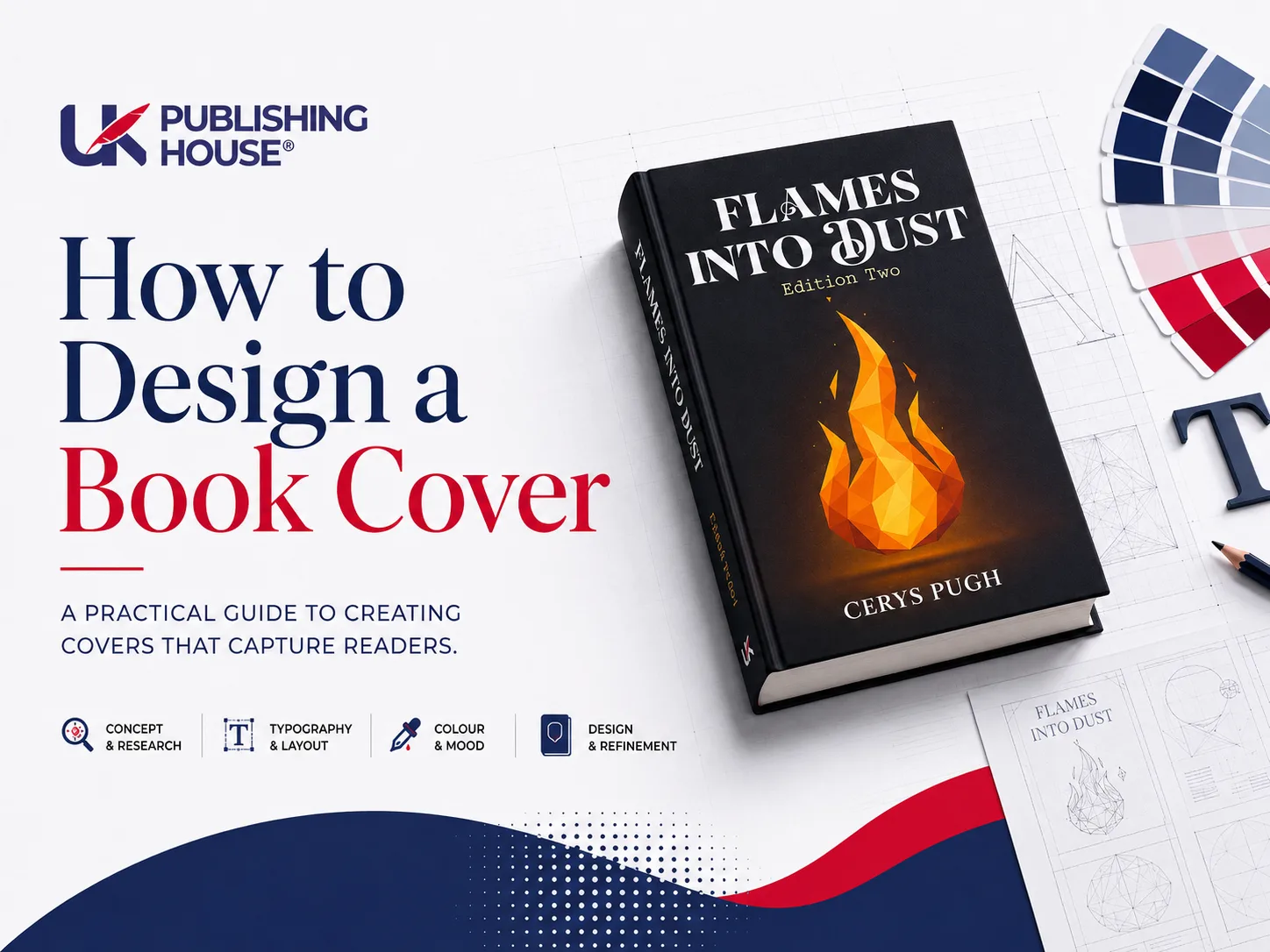
Most self-published authors lose the sale before a reader ever opens the sample chapter. It is rarely the writing that does the damage. It is a cover that quietly says "amateur" from the thumbnail, and the reader scrolls on without quite knowing why.
That is the brutal part. You have already wrestled with plot holes, rewritten the saggy middle, and fought Amazon's category menu until your eyes watered. Now you are told you have to become a graphic designer as well. The software looks hostile. The specs read like engineering documents. And every hour spent arguing with GIMP is an hour you are not spending on the next book. Worse still, a mismatched cover does not just look a bit off. It signals to a buyer that the story inside might be just as sloppy, and that doubt is expensive.
This guide is a strict, budget-tiered roadmap built for people with no formal design training. You will learn to design for the one-inch Amazon thumbnail first and then scale up to a print-ready file, which is the opposite of how most beginners do it. You will get exact KDP and IngramSpark numbers, a zero-budget workflow, and a short pre-design checklist that cuts your revision rounds roughly in half. No art degree required. You simply need to treat the cover as market signalling rather than personal art, and the rest gets a lot easier.
Designing a book cover comes down to a single question asked over and over: does this image tell the right reader, in three seconds, that this book is for them? Everything below is in service of answering yes.
DIY or Hire Out? A Realistic Decision Framework
Before you open any software, be honest about which path you are actually on. Plenty of authors waste a fortnight learning a tool when they should have hired out, and plenty pay for a designer when a template would have done the job. Both mistakes hurt.
Start with a plain audit of three things: money, skill, and time. How much can you spend without delaying your launch? How willing are you to learn a new program from scratch? And how hard is your deadline? Write the answers down, because the honest version of those numbers usually points clearly in one direction. Knowing when DIY is enough versus when to hire a professional comes down to a simple test: can your budget absorb a £250 to £600 cover fee without pushing your release date? If yes, hiring out is often the calmer choice. If no, you design it yourself and design it well.
People forget the hidden cost of a bad DIY cover, and it is steeper than the money saved. A weak cover drags down your click-through rate on the very first impression. Fewer clicks mean fewer sample reads, fewer sample reads mean fewer sales, and the whole funnel narrows from the top. In a crowded category, "good enough" is a trap, because your book is sitting in a grid next to twenty covers that were not good enough either. The one that looks confident wins.
There are a few honest red flags that mean you should pay a pro. Complex original illustration. Epic fantasy with a detailed map worked into the art. Hand-lettered typography or effects that no template can fake. And the big one: a launch date so tight that there is no room for a learning curve. If any of those describe you, the smartest move is to commission the work and protect your timeline. If you want a sense of what professional rates look like in this market, it is worth reading what professional book cover design actually costs before you decide.
DIY is genuinely the smarter bet in a few cases too. Early-career authors testing a genre, writers running a pen name they are not sure they will keep, and anyone on a rapid-release schedule where speed and cost control matter more than bespoke art. The industry benchmarks here are not folklore. Organisations like the IBPA publish industry standards for self-published books, and Amazon KDP's documentation sets out the technical requirements your file has to meet, so you can measure your own work against a real standard rather than a gut feeling. Once you know which path you are on, the next step is the same for everyone.
The Pre-Design Strategy Checklist: Build Your Cover Brief First
Here is the step almost every beginner skips, and that's why they end up with eleven versions and a headache. Before you touch a single pixel, you write yourself a brief. Professionals never start cold, and neither should you.
Begin by naming your sub-genre precisely and then listing three to five comparable bestsellers, the books a reader of yours would already own. These comp titles are not just marketing data. They are your visual brief. When you line up five covers that your ideal reader has happily paid for, you are looking at a coded set of instructions for colour, mood, and type. Your job is to read the code, not reinvent it.
Next, translate your story into design keywords. This sounds abstract until you do it, and then it is obvious. A cosy mystery becomes warm palette, illustrated objects, friendly rounded type. A hardboiled crime novel becomes desaturated colour, hard shadows, a bold condensed sans-serif. You are converting plot into mood, and mood into a small list of words you can actually design from. Three or four keywords are plenty.
Then, and this matters more than anything, set your thumbnail test criteria before you start rather than after. Decide upfront that the cover must pass three checks at one-inch scale: the title is legible, the genre is obvious, and the focal point is clear. This is the three-second rule, and it is not a nice-to-have you check at the end. It is the standard the whole design has to meet from the first sketch.
Put all of this on one page. A proper cover brief has fields for your sub-genre, your comp titles, your mood keywords, your target reader, the emotional promise of the book, and where it sits in a series if it has siblings. Treat that single sheet as the thing every later decision has to answer to. Authors who fill it in honestly cut their revision rounds dramatically, because they stop designing by vibe and start designing against a target. With the brief written, you can finally start reading your genre properly.
Understanding Your Genre's Visual Grammar
Every genre speaks a visual language, and readers understand it fluently even though almost none of them could explain it. Your cover has to speak that language without an accent. The good news is that you can learn it in an afternoon.
Go and pull the top twenty bestsellers in your exact sub-genre, not the broad category. Screenshot every cover and lay them out in a grid. Then play detective. What fonts keep showing up? Are the images photographic or illustrated, bright or moody? Where does the title sit, top or bottom, and how big is the author name relative to it? Within twenty covers you will see the same handful of patterns repeating, and those patterns are the grammar. They are there because they sell, and ignoring them is a deliberate risk.
This is where a simple genre decision matrix earns its keep. The idea is to map your sub-genre to its expected colour palette, its typical imagery, and its typographic mood, so a cosy mystery never accidentally dresses up as hardboiled noir. Romance leans warm and human, often with a couple or an evocative object. Thrillers go high-contrast, often a lone figure or a charged landscape. Science fiction reaches for cool tones, scale, and clean futuristic type. Literary fiction strips back to a single striking image and restrained typography. Knowing where you sit on that map stops you from making a choice that quietly repels your own audience. If you are still settling which lane your book belongs in, this guide to the different types of fiction genres is a useful place to anchor yourself.
Colour and imagery carry more meaning than most new authors realise. Deep reds and blacks promise danger. Soft pastels and hand-drawn elements promise comfort. A figure shot from behind invites the reader to step into the story, while a face looking straight out tends to suit character-led drama. These conventions exist for a reason, and you only break them on purpose, with a clear commercial argument for doing so. There is a difference between a fresh take and a confusing one.
Which brings up the uncomfortable truth at the heart of all this. Your cover is an advertisement for a reading experience, not a gallery piece. The cover that perfectly captures your private artistic vision and the cover that sells are sometimes the same thing, but when they are not, market signalling wins. You are not selling your taste. You are selling a promise to a specific reader, and the clearest promise gets the click. Once you know what your genre expects, you need a method for building it, and the method starts very small.
The Thumbnail-First Design Method
Most design advice tells you to work big and shrink later. For book covers, that is exactly backwards, and it is the single biggest reason DIY covers fail. Your reader almost never meets your cover at full size. They meet it as a thumbnail roughly one inch wide, on a phone, while scrolling. So that is where you design first.
Build your concept at thumbnail scale and judge it there. If the title cannot be read at one inch, the title is wrong, no matter how beautiful it looks at full resolution. If the focal image turns to mush when small, the image is wrong. Designing thumbnail-first forces ruthless clarity, because tiny canvases punish clutter instantly. You earn the detail later, once the small version already works.
Then run the grayscale test. Strip all the colour out and look again. This is not a gimmick. A surprising number of covers rely on colour contrast that collapses the moment you remove it, which is exactly what happens on a colour-blind shopper's screen or an e-ink reader. If your value contrast, the difference between light and dark, still carries the hierarchy in grayscale, your design has real bones. If everything blurs into one grey mush, your contrast was an illusion.
Make the testing a fixed routine, not a final glance. Export a JPEG around 180 pixels wide. View it on your actual phone, held at arm's length, the way a real buyer holds theirs. Check whether you can read the title, whether the genre is clear, and whether your eye lands somewhere on purpose. Do this at three stages, early, middle, and just before export, and treat a failed check as a stop sign rather than a suggestion. The grayscale, one-inch, and mobile tests together are the gate every version has to pass.
Only after the small version sings do you scale up to full print resolution. Flipping the traditional order this way saves you from the classic disaster, the gorgeous full-size cover that nobody can decode in the store. Design small, prove it works, then expand. With the method clear, the first real ingredient to get right is your type.
A Practical Guide to Typography & Font Pairing
Typography is where amateur covers give themselves away fastest, and also where you can look professional with surprisingly little effort. The whole thing rests on one rule.
Two fonts. That is the limit. One dominant display face for the title, and one clean, quiet face for the author name and any secondary text. The display face carries the personality and the genre signal. The clean face simply gets out of the way and stays readable. The moment you reach for a third or fourth font, the cover starts to look like a ransom note, and the eye no longer knows where to go. Restraint reads as confidence.
Hierarchy has to survive the thumbnail shrink, which is the real test of any cover type. Decide what the reader sees first, second, and third, then build size, weight, and placement to enforce that order. Usually the title is largest and boldest, the author name smaller, and the subtitle smaller still or gone entirely. If your title and author name are fighting at one inch, the hierarchy has failed, and you fix it with contrast in scale, not with more decoration.
Match your typeface to your genre, because fonts carry genre meaning whether you intend it or not. Serifs tend to suit literary, historical, and traditional fiction, lending an air of weight and craft. Clean sans-serifs suit thrillers, science fiction, and contemporary stories. Romance often blends a soft script with a steady sans. The fastest way to look self-published in the bad sense is to reach for the same handful of overused free fonts that every beginner uses, so audit your genre's bestsellers and choose type that lives in their world.
Then there is the part nobody enjoys but everyone must respect: licensing. "Royalty-free" does not mean "free to do anything." Verify the commercial-use licence for every font, and understand that a desktop licence, an ebook embedding licence, and a print-run licence are three different permissions. Sources like Adobe Fonts and Font Squirrel make this easier by stating usage rights plainly, which is exactly why they are worth using over a random font you found online. Getting this wrong can mean pulling a published book, so treat it as part of the design, not an afterthought. With type settled, you need something for it to sit on.
Sourcing and Working with Images
Your imagery is the other half of the first impression, and it is where the cliché trap lives. Free stock is a gift and a curse. The libraries are huge, but so is the temptation to use the same shots everyone else has already used.
For tight budgets, Unsplash, Pexels, and Pixabay offer enormous free libraries, and there is genuinely strong work in there if you dig past the first page. The skill is learning to spot the overused. The smiling woman with a coffee cup, the hooded figure standing in fog, the lone tree on a hill. The instant a reader half-recognises a stock photo, a little trust drains away, because it signals that no real care went into the cover. Your aim is to find images that have not been worn smooth by overuse, and then to make them your own.
For authors with no budget at all, there is a complete zero-cost path. Public domain assets, free editing tools, and a bit of patience can produce a genuinely professional result. The trick is transformation. Rarely should a free image go on a cover untouched. Crop it hard to find a stronger composition, colour-grade it to match your mood keywords, add a tone or overlay to unify it, and suddenly the picture that ten thousand people downloaded looks like yours alone. A free image plus deliberate treatment beats an untouched paid one nearly every time.
Understand what the licence actually permits for a book, because this is subtler than most assume. Editorial-use images cannot be used commercially, and a book cover counts as commercial use. Photos of recognisable people may need a model release. And print-on-demand distribution counts as commercial use, full stop. Read the terms for each asset and keep a record of where every image came from. It is dull, and it protects you thoroughly.
When you start combining assets, keep your quality intact. Simple layering and masking let a non-designer build an original composite from two or three images, which is often the fastest route to something that looks bespoke. The rule while you do it is to hold the line at 300 DPI across every element, because one low-resolution piece dropped into a high-resolution file will print soft and betray the whole cover. Source carefully, treat boldly, and check resolution constantly. Now you assemble it all into a repeatable process.
The Step-by-Step Design Workflow
This is the part you can actually follow with your hands. The workflow below is deliberately the same whether you are in Canva, GIMP, or Photoshop. The tools differ, the order does not.
Start with concept and mood boarding. Pull your comp covers, your colour swatches, and a few texture references into a single board, physical or digital, it does not matter. Then set one harsh rule for yourself: if an element does not help the cover pass the thumbnail test, it does not go on the cover. The mood board is where you decide, before you commit, what the book should feel like at a glance.
Set up your canvas with the correct specs from the very start, because fixing this later is painful. For a print cover, KDP requires a 0.125-inch bleed and a minimum of 300 DPI, and recommends CMYK for predictable print colour. Create your new document with those numbers baked in rather than designing first and panicking about specs afterwards. The same logic applies in Canva, GIMP, and Photoshop, you simply enter the figures in different boxes.
Now compose. Keep every piece of critical text and your main focal image inside the safe zone, comfortably away from the trim and bleed lines, so nothing important gets shaved off in printing. A quiet trick for non-designers is the rule of thirds: imagine the cover split into a three-by-three grid and place your title or key image near where the lines cross, rather than dead centre, for a composition that feels considered.
Guarantee your contrast with the gradient overlay trick. Drop a semi-transparent dark bar or a soft gradient behind your text, and white type suddenly reads cleanly over even a busy background without you having to destroy the image underneath. It is the single most reliable fix for "I can't read the title."
Before you finalise, run the mirror-and-squint test. Flip the whole cover horizontally and squint at it. Mirroring breaks your brain's habit of reading the words, so you finally see the layout as pure shape, and imbalances, weak focal points, and dodgy contrast jump straight out. Fix what the squint reveals.
Then export properly. Keep a master file in CMYK for print, but always retain an RGB master too for digital marketing and web previews, since screens and paper handle colour differently. Your export checklist is short: a flattened print-ready PDF, a layered master you can edit later, an RGB JPEG for the web, and a thumbnail test file. With the file built, it is worth understanding the specifications underneath it, because that is where most rejections come from.
Technical Specifications & Print Standards
The specs are not glamorous, but they are non-negotiable, and getting them wrong is the most common reason a print file bounces back. Learn the four ideas below and you will sidestep the vast majority of print-on-demand rejections.
Bleed, trim, and safe zone are the foundation. Trim is the final cut size of your book. Bleed is the extra margin of artwork, that 0.125 inches, that extends past the trim so there is no white sliver if the cutting blade drifts. The safe zone is the inner area where your text and key images must stay, well clear of the cut. Get these three right and your cover survives the guillotine intact.
Element | What it is | Typical spec/rule | Why it matters |
Trim | The final cut size of your book | Your chosen book dimensions (e.g. 5" x 8", 6" x 9") | Defines the actual page size after printing and cutting |
Bleed | Extra artwork extending past the trim edge | 0.125 inches on every outer edge | Prevents a white sliver if the cutting blade drifts |
Safe zone | The inner area for critical content | Keep text and key images well inside the trim line | Stops important elements being shaved off in printing |
Resolution | Image detail for print | 300 DPI minimum | Low DPI prints blurry or pixelated |
Colour mode | How colour is rendered | CMYK for print, RGB master for digital | Colours shift between screen and paper if set wrong |
Spine width | Width of the book's spine | Page count x paper thickness (use platform calculator) | Misjudging it throws off spine text alignment |
Resolution comes next, and here the rule is blunt: 300 DPI is the floor for print, not a target to aim near. A low-resolution source will look fine on screen and then print blurry or pixelated, and the classic trap is grabbing a 72 DPI web image for a 300 DPI cover. If an image is not big enough at 300 DPI to fill the space, it is the wrong image.
Colour mode trips up nearly everyone at least once. Screens use RGB, print uses CMYK, and colours can shift between the two, with vivid blues and bright greens being the usual casualties. Design in CMYK for anything heading to print, and soft-proof inside your software, previewing the CMYK version on screen, before you export so there are no nasty surprises when the proof arrives.
Spine width is simple maths once you know the formula: page count multiplied by paper thickness gives your spine width, and every platform provides a calculator so you never have to guess. On the back cover, place your barcode, blurb, and author photo with the same safe-zone discipline as the front, leaving the barcode area clear. If you want a fuller breakdown of trim choices for physical books, this guide to standard paperback book sizes and dimensions saves a lot of trial and error.
Finally, the specs are platform-specific, and pretending otherwise gets files rejected. KDP, IngramSpark, and Draft2Digital each have their own template requirements and their own common rejection reasons, so use each platform's own calculator and template rather than generic advice. Always cross-check against the latest official documentation, since these numbers do change. KDP is the starting point for many UK authors, and weighing the benefits and drawbacks of Amazon KDP is worth doing before you commit your file to a single distributor. With the specs handled, the only question left is which tools you use to hit them.
Essential Tools & Resource Comparison
There is no single best tool, only the right tool for your budget and your nerve. The fastest way to kill a cover project is decision fatigue, so match yourself to one of three honest tiers and stop browsing.
The zero-budget beginner works in free tools and free imagery and can still produce something genuinely professional. The serious indie who is happy to pay a small monthly fee gets smoother software and better stock access. The technically confident author who wants total control moves into industry-standard programs and accepts the learning curve in exchange for precision. Pick your tier first, then pick your tools, in that order.
Tool | Best for | Cost tier | Key strength |
Canva | Quick layouts and template-based design | Freemium | Drag-and-drop book cover templates with a built-in stock library |
Adobe Photoshop / Illustrator | High-control raster and vector editing with print export | Pro (subscription) | Industry-standard precision for CMYK, layers, and typography |
GIMP | Free raster editing with Photoshop-like features | Free | Open-source alternative for image manipulation and compositing |
Book Brush | Book-specific 3D mockups and cover layouts | Freemium | Purpose-built tools for book covers and promotional graphics |
Unsplash, Pexels & Pixabay | Sourcing free photography and illustrations | Free | Large libraries of no-cost imagery for tight budgets |
Adobe Fonts & Font Squirrel | Licensing commercial-use typefaces | Free to subscription | Curated, legal font libraries with clear usage rights |
KDP / IngramSpark calculators & templates | Generating exact print dimensions and spine width | Free | Platform-native accuracy for bleed, trim, and spine specs |
Each tool has honest trade-offs, and pretending otherwise helps nobody. Canva is wonderfully quick and template-friendly, but its CMYK print handling has historically been weaker than the professional programs, so check your print proof carefully. GIMP is free and powerful, but its interface is famously unfriendly to newcomers and takes patience to learn. Photoshop and Illustrator give you complete control and reliable print output, but they cost a recurring subscription that not every first-time author wants. Book Brush sits in a useful middle ground for book-specific mockups and promotional graphics. None of these is wrong, they simply suit different people.
To match the tool to your skill, follow a short decision tree. If you only need an ebook cover and have no budget, start in a free tool with free stock and the zero-budget workflow. If you are building print covers regularly and have a little money, a freemium or subscription tool pays for itself in time saved. If you are confident with software and want pixel-level control, go straight to the professional programs. And one quiet discipline that keeps you out of trouble: note the date you last verified any pricing, interface, or platform spec, because freemium limits and template requirements change often, and last month's certainty becomes this month's rejection. When you would rather hand the whole thing over, our professional book design team handles exactly this. With your tools chosen, it helps enormously to study covers that already work.
Annotated Cover Autopsies: What Bestsellers Get Right
Abstract rules only take you so far. The fastest way to improve is to take a cover apart and see precisely why it works, which is exactly what professionals do, just usually in their heads.
Take a commercially successful cover in your genre and dissect its anatomy. Find the underlying grid, the invisible lines the elements sit on. Identify the single focal point your eye lands on first. Notice the colour psychology doing quiet work in the background, and study how the typographic hierarchy guides you from title to author name without you noticing the handover. A bestseller is rarely lucky. It is built on structure, and once you can see the structure, you can borrow the principle without copying the art.
The before-and-after comparison is the most instructive exercise you can do on your own work. Put a cluttered amateur version next to a tightened one and watch what changed. Usually it is subtraction. One image instead of three. One clear focal point instead of four competing ones. Stronger contrast behind the title. A tidier hierarchy. Seeing the two side by side teaches more than any list of rules, because you witness the improvement rather than being told about it.
Then apply the same autopsy across genres, because the principles hold even as the look changes. A romance cover, a thriller cover, and a literary fiction cover obey different visual grammar, but each one still rests on a grid, a focal point, and a deliberate type hierarchy. Run the autopsy on three or four covers in your niche and you will internalise the patterns far faster than by reading theory. Studying what works naturally trains you to spot what does not, which is the next thing to master.
Common Amateur Mistakes & How to Fix Them
Most DIY covers fail in the same few ways, and every one of them has a known fix. Learn these four and you have ruled out the bulk of beginner errors before you make them.
Clutter and competing focal points come first. The symptom is too many images, too much text, and no clear place for the eye to enter. The fix is ruthless subtraction and the one-focal-point rule: decide on the single thing the reader should see first, and remove or quieten everything that fights it. A near-empty cover almost always beats a busy one.
Low-contrast text that vanishes at small sizes is the second killer. The symptom is pale type on a fussy background, or a font weight too thin to survive the shrink. The fix is to darken the area behind the text, increase the font weight, or apply the gradient overlay trick so the title sits on a calm patch and reads cleanly even at thumbnail scale.
Overused stock clichés are the third. The symptom is an image a reader has seen a hundred times, which instantly cheapens the cover. The fix is treatment: crop hard, colour-grade decisively, and combine two or three assets into a composite that no longer looks like anyone else's. You are turning a familiar photo into something that belongs only to your book.
Incorrect aspect ratios and stretching are the fourth, and they look careless even from across a room. The symptom is a square image forced into a rectangular cover, or type and photos squashed to fit. The fix is to respect each platform's required ratio and to scale non-destructively, never stretching one dimension to make something fit. If you avoid those four, your cover already sits in the top tier of self-published work. The next level is making it scale across a whole series.
Building a Series Brand That Scales
If you are writing more than one book, your cover stops being a single object and becomes a system. Get the system right once and every future cover gets faster and stronger.
The strategy is to lock the template first and swap the imagery later. Before you finalise book one, settle the typography, the layout grid, and the spine style, then treat those as fixed. For each new title you change only the artwork inside the locked frame. This is how a series reads as a family at a glance while still letting each book have its own face, and it is the secret behind every series whose covers you can spot from across a bookshop.
Consistency lives in the details. Keep the author name and series title in identical positions on every cover, in the same fonts at the same sizes, so a returning reader recognises you instantly. Manage your spine text carefully too, since page counts vary between books and a changing spine width can throw off alignment if you are not paying attention. Small inconsistencies break the spell, so they are worth guarding.
Brand recognition also has to survive across formats. Your ebook, paperback, and hardcover should read as the same product, even though their proportions and finishes differ, so check that the locked elements translate cleanly from one to the next. If you are moving into premium formats, it is worth understanding how hardback book printing in the UK differs before you adapt your template. A consistent series cover is one of the most powerful marketing assets an indie author owns, and once it is locked, you are nearly ready to publish.
Final Export, Testing & Upload Checklist
You have designed it. Do not rush the last mile, because this is where avoidable rejections happen and momentum dies. Run a short technical audit before you upload anything.
Confirm the basics in order: bleed is present, resolution is a true 300 DPI, fonts are flattened or embedded so nothing reflows on the printer's machine, and the barcode area is clear. Then check your export settings dialog one last time to make sure the resolution and colour mode are exactly what each platform expects, since a single wrong setting here undoes hours of careful work.
Match your export to your destination. KDP and IngramSpark have different cover file requirements, with IngramSpark in particular expecting your art laid over its supplied template. For an ebook-only release, an RGB JPEG at the right dimensions is all you need, and the CMYK print fuss does not apply. Export the right file for the right place rather than one file for everything.
Then test like a reader, not a designer. Run a final thumbnail check at 180 pixels wide, and if the title still reads and the genre still lands, you are close. The last and most worthwhile step is to order a single physical proof before you announce anything, because a screen will never show you the true colour, the real contrast, or that one fuzzy element you missed.
If your file does get rejected, do not panic or rebuild from scratch. The usual culprits are simple: missing bleed, resolution too low, or spine text sitting too close to the edge. Each one is a quick, targeted fix rather than a redesign, so read the rejection notice, correct the single issue it names, and resubmit. Once the cover is approved, it joins the rest of the launch, from book printing and clean interior book formatting to a final round of professional editing on the words inside it.
A cover, in the end, is the shortest pitch your book will ever make. Three seconds, one inch, one decision. Design for that and the rest follows.
If you would rather have specialists carry it from manuscript to shelf, our full range of self-publishing services covers everything from publishing your book to book marketing, a custom author website, and a book video trailer to launch it loudly. And if the writing itself is the bottleneck, our fiction ghostwriting and book ghostwriting teams can help you finish the manuscript that deserves a cover this good.